


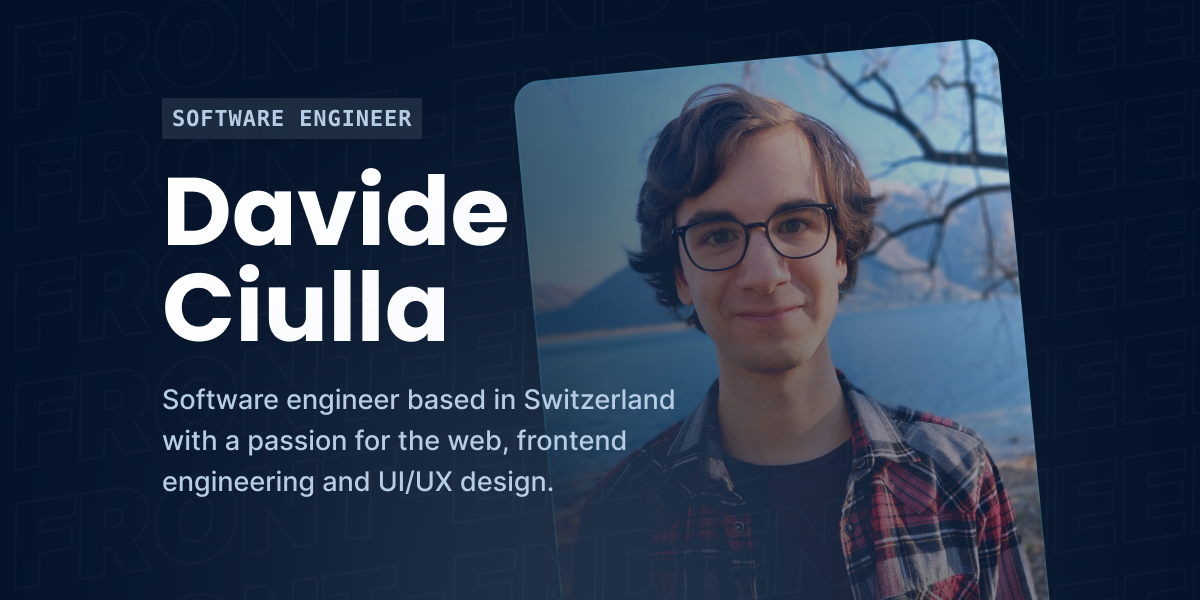
Portfolio Website (2022)
22 Feb 2024 • 5 MIN READ
Project type
Website
Year
2022
Roles
Developer, Designer
Tools and technologies
SvelteKit, TypeScript, Tailwind, Sanity, Figma
In a nutshell
This is the case study of the 2022 version of my personal portfolio website. On my portfolio, people can find links to my social profiles, read some information about myself, take a look at my latest and most representative projects, read case studies and blog articles, and get in touch with me.
Introduction
As a software engineer with a heavy focus on frontend engineering, I think it’s important to have a portfolio. It’s not strictly necessary, and some people can find jobs without having one, but I’m a firm believer that having a good portfolio can make your profile stand out from other candidates during a competitive hiring process.
For this reason I’ve gotten used to revamp my website almost every year. In a year your experience grows, you build new projects, you continue to develop your design taste, new libraries come out, you get tired of some technologies you were previously using or you might even decide to change your focus and rebrand yourself completely.
Preliminary design analysis
When doing a redesign it’s very important to perform a thorough design analysis of the current state of the project, in order to highlight what was already working and to identify possible areas of improvement. This preliminary step is also fundamental, because the more time you put in at this stage, the lower are the chances of needing to make changes in production, when it’s a lot more expensive to operate.
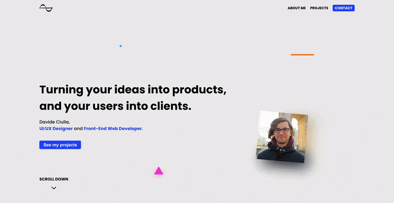
Negative aspects
By analyzing the 2020 version of my portfolio, I took the following negative notes:
- Colors: generally too light and I don’t like the light greyish color that I used for the background
- Colors: too few colors (literally 3 brand colors in the entire website)
- Layout: the width is set to 100% of the viewport width, which might look awkward on very large screens
- Navbar: the nav-items get a little too small on mobile
- Navbar: it disappears when scrolling and you need to go back to the top each time
- Hero section: no need to take up the entire viewport height
- Hero section: I get the idea of the three colored shapes, but they don’t communicate much and look pretty bland
- Hero section: the value proposition is a bit too generic and it doesn’t say much
- Hero section: the photo isn’t particularly great
- About section: the bio is a little too short and it doesn’t say much about myself and my strengths
- About section: feels a little squashed in height
- About section: social media names are easier to be recognized when their names are next to their logo
- Projects section: I would leave out projects that are just design, since I’m now more interested on the engineering side of things (I’m still interested in UI/UX, but I don’t want projects that are just UI/UX)
- Projects section: projects could be grouped in more specific categories
- Projects section: the projects description is too short, and it doesn’t give insights on the thought and decision-making process to the reader
- Contact section: the form fields look weird without a text placeholder
Positive aspects
On the positive side, I thought the following points were actually decent:
- Colors: I like the type of blue I was using as the primary color
- Hero section: I like the text layout on the left with the value proposition, the sub-heading and the call-to-action
- About section: it might seem redundant since the CV can be seen by clicking on button in the left column, but I like the idea of stating which are your top skills and technologies in the bio
- Projects section: the layout is good and the cards are nicely done
- Projects section: each project has all the right elements (i.e. title, description, labels, list of tools and technologies, link to the live product, link to the GitHub repository)
- Contact section: the form is clean and nicely put together
Results
At the end of this preliminary design analysis, I had collected enough feedback notes (21 total: 15 negative, 6 positive) to know with certainty that my previous portfolio needed to be reworked, as it didn’t meet my standards anymore.
Preliminary technology analysis
On the development side of things, the 2020 version was very simple and it comprised of the following few technologies:
In 2020, when I chose Gatsby and SCSS, I was using Wordpress for some projects, and Gatsby was very appealing to me because it had lots and lots of plugins that were easy to add and required little configuration. I also liked SCSS quite a bit, because it allowed me to nest selectors and get access to a wide range of built-in modules - such as
sass:colors- that were very handy to mix and adjust colors.
Despite its positives, I wouldn’t pick Gatsby again because it forces you to use GraphQL for pretty much anything related to data. I don’t mind GraphQL and I think it’s an amazing query language, but I felt uncomfortable using it for everything, and at some point it just became a burden.
Regarding SCSS, I would pick it anytime over vanilla CSS, but I currently enjoy CSS-in-JS and utility classes frameworks like Tailwind more, because it’s easier to encode certain behaviors when the bridge between JS and CSS is very thin, they have a really good optimization layer and they avoid ending up with colliding CSS class names.
Hence, yet again, it was clear I was also feeling the need to change the technologies I was using.
What’s changed
At the end of these preliminary analysis sessions, I had collected enough feedback notes to know what I needed to change in order to get to the final result I had in mind.
Design
During the design phase I often referenced the feedback notes (both positive and negative), which were instrumental to make the following very targeted design decisions:
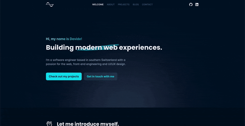
- Colors: dark theme instead of a light one
- Colors: more extended color palette
- Layout: better items positioning, better use of whitespace and ad-hoc layouts for articles
- Layout: fixed width when not on mobile
- Typography: Poppins for headings and Inter for body text
- Navbar: hidden when scrolling down and visible when scrolling up
- Navbar: the nav-items must be at their original size and horizontally scrollable
- Navbar: add a few social links
- Hero section: no more meaningless shapes
- Hero section: don’t stretch to the viewport’s height
- Hero section: remove the “scroll down” indicator since the height will be lower
- Hero section: move photo of myself to about section
- About section: bio should be short but a bit longer than its current state
- About section: don’t show the list of languages and social media profiles
- About section: keep only the main technologies I’m currently using, and integrate them in the text on the left
- Projects section: cards are nice, but should take more space and show a little more info
- Projects section: more specific labels
- Projects section: projects need more in-depth case studies
- Contact section: remove the form and only keep the email
In addition to all that I also decided to add a dedicated blog section for case studies and articles, as well as a footer.
Technologies
For the 2022 version, I decided to switch from Gatsby to SvelteKit since in the past 2 years I’ve become a huge Svelte fan. I still like React a lot, but now I cherry pick the right framework/UI library for the type of project I’m about to work on. For styling, I moved from SCSS to Tailwind, which I enjoy a lot. I also moved all my content from being hard-coded in the codebase to Sanity, a headless CMS that allows me to edit and add content with a lot more ease.
Related posts.

It's been a long road, but I'm so excited to finally be able to share the latest (2022) version of my portfolio with the world!
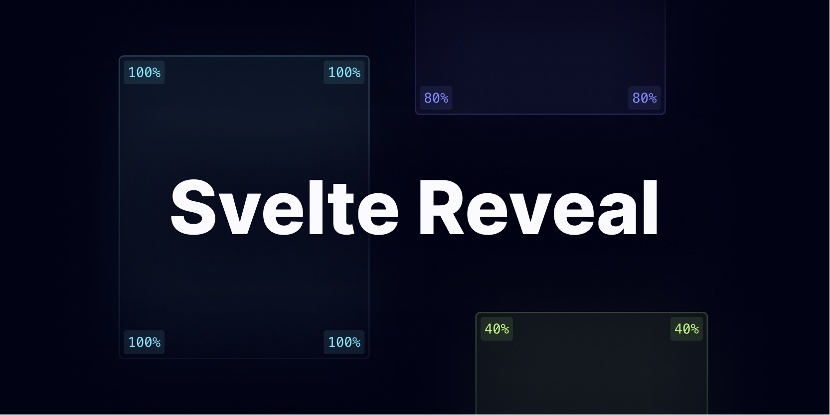
An open-source NPM package to easily create reveal on scroll animations in Svelte with first-class TypeScript support and near zero configuration.
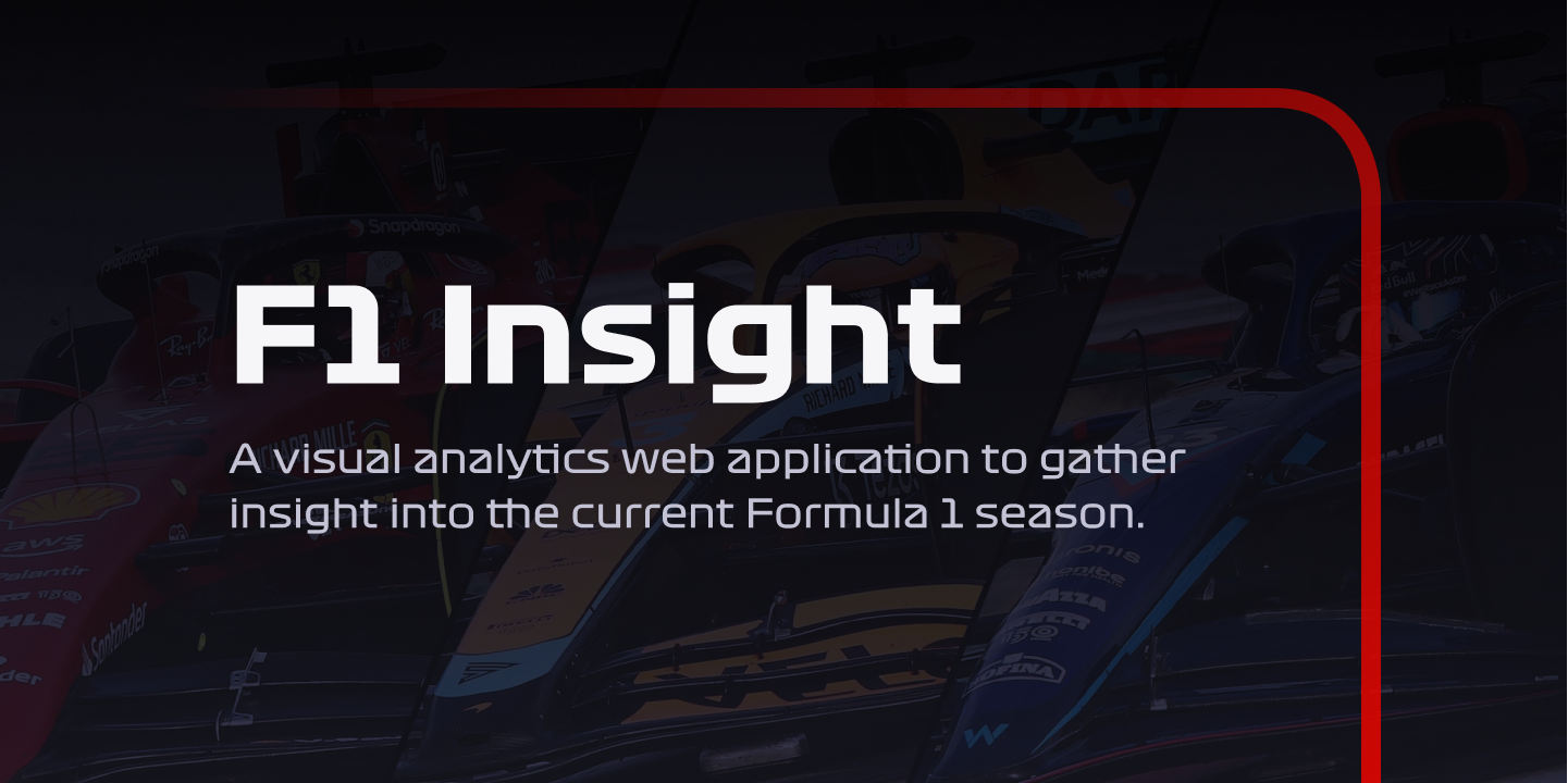
A visual analytics web application to easily gain insight into the current Formula 1 season, and spot trends that would otherwise be difficult to notice.
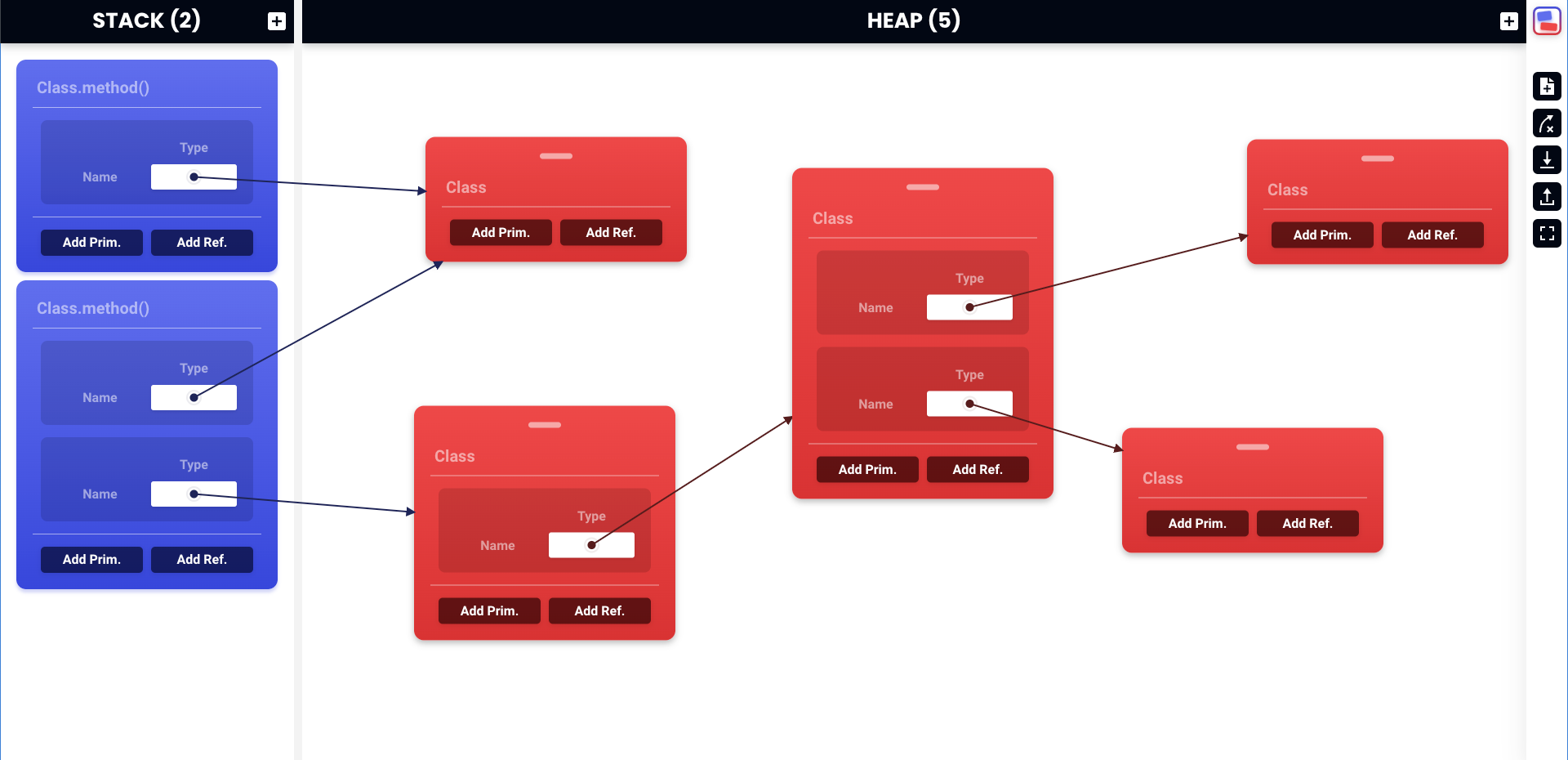
An interactive web application to easily create and manipulate stack and heap diagrams in the context of a university programming fundamentals course.